TEAM
Agency: LOCAL
2018
Lightbox
Corporate identity design
SAVANA BY VICEROY
2019
Savana by Viceroy
Identity design & branding
for a real estate project.
THE BRIEF
Savana by viceroy is a residential property with a rare location: the helm
of the Borivali national Park in Mumbai. The client wanted to create a brand
that would pay homage to the flora and fauna of this forest and embody
the eco-friendly lifestyle and balanced coexistence with nature that the
project stands for.
THE SOLUTION
Savāna was designed to be a new way of looking at luxury. We focused on highlighting what luxury means to people in urban cities beyond square feet and bedrooms- sunlight, space, privacy, convenience and above all, fresh air.
In order help the user embrace this lifestyle, we knew that we would have to take a 360˚turnkey approach to branding, building everything from a visual language and identity to sights, smells and even music, to bring Savana to life.
LOCAL RESEARCH
Over multiple conversations and workshops, we understood what Savana
stood for and locked on its Brand Values.


"Luxury in Mumbai means
having access to nature"


Savana stands for luxury living that goes beyond brick and mortar
to the life and the experiences a property can offer you.
LOCAL decided to focus on the details that you can see, touch and experience every day: sunbeams in every room, high ceilings and rooms that breathe, elevators you never have to wait too long for, gardens filled with chirping birds and bright butterflies.
We consciously broke away from the overpowering visual language of most Indian real estate and built a colour palette, tone of voice and visual language that embraces what sets Savana apart. Luxury as the embodiment of a balanced life in harmony with nature.


the local approach
NAMING

LOGO DESIGN
A relaxed, balanced type based logo inspired by neighborhoods in the city that embody a balanced lifestyle.


"What does it mean to have a balanced life?"
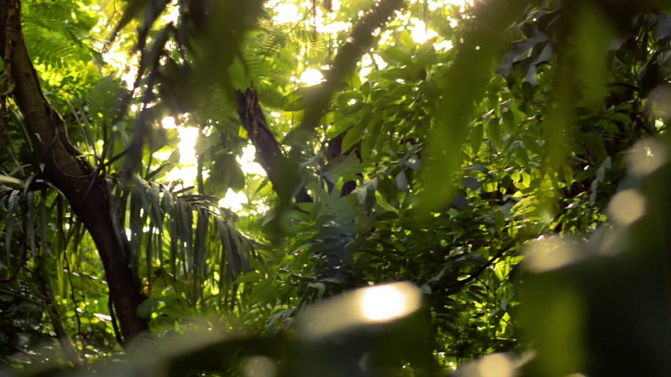
BRAND IMAGERY
Both in the brand's voice and its visuals, we focused on luxury as a set of everyday experiences.


BRAND ICONS
We extended the minimal and balanced design of the logo to craft a set of brand icons composed of clean, white lines.


BROCHURE DESIGN

To enhance the customer experience, we created a series
of brand touch points ranging from maps to music.
custom map design

Experience center

DIGITAL ASSETS
lobby music

construction site branding

We used Savana's soothing and minimal aesthetic to offer a break from the visual overload
of the city instead of adding to it, something typical real estate branding tends to do.
outdoor
"We had an amazingly creative and collaborative experience with LOCAL. They just got what we wanted to do with the brand, and helped us crystallise and distill this into an easily understandable design philosophy."
Cyrus Mody, Managing Partner, Viceroy Properties


